Color Trends of 2026: 5 Palettes We Love
Each year, color trends evolve alongside the way we live in our spaces. In 2026, color is no longer about making a statement for the sake of it. Instead, it sets the mood, enhances materials, and supports everyday comfort. The focus shifts from fleeting trends to palettes that feel grounded, nuanced, and made to last.
Here are the 5 color trends for 2026 we’re seeing emerge.
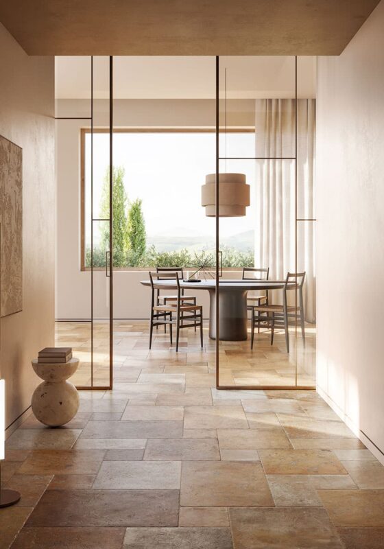
1. Mineral Beiges: A New Warm Foundation
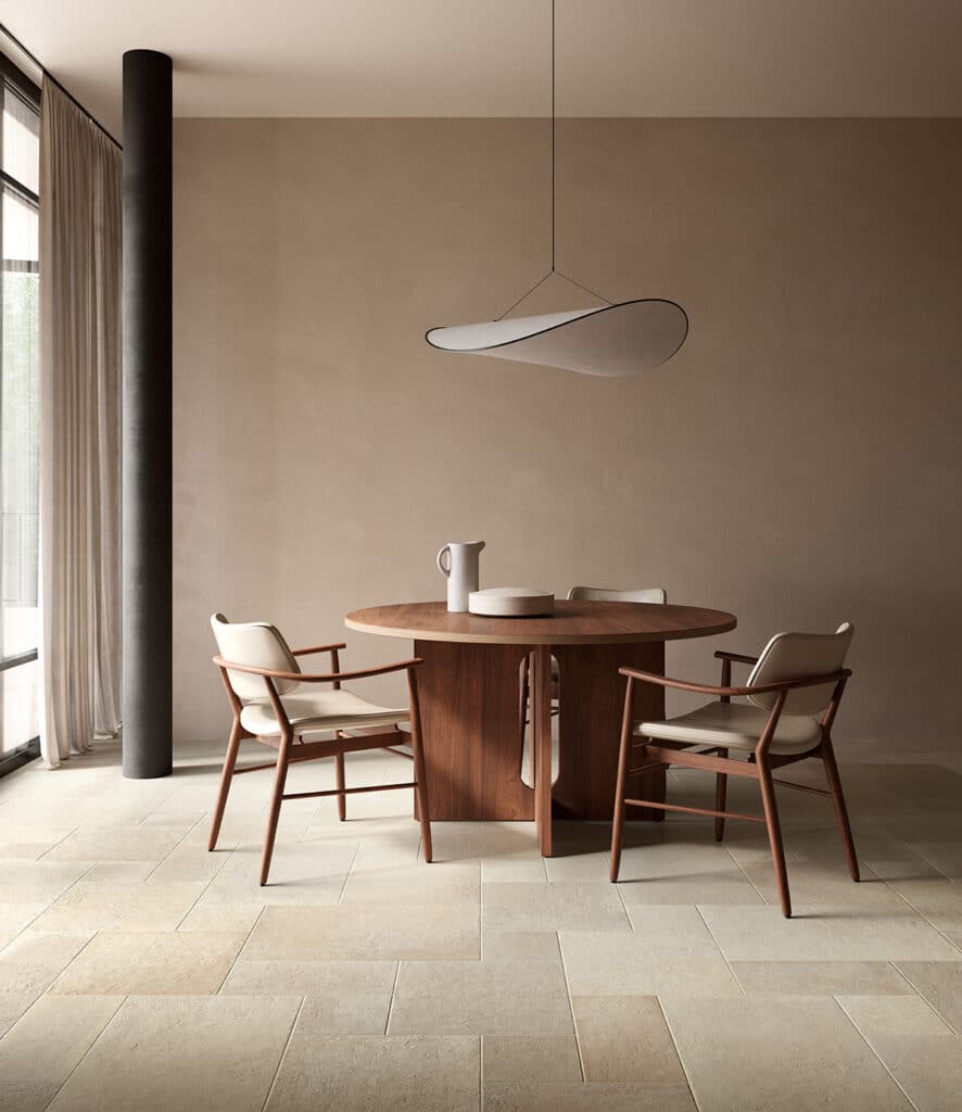
Beige remains a key color in 2026, but with more depth and character. Think mineral beiges: warm sand, soft cream, stone-inspired neutrals, and lightly patinated ivory.
These tones create a calm, welcoming backdrop that highlights natural textures like wood, ceramic, and stone. They work effortlessly across kitchens, bathrooms, and living spaces.
Why this color trend works in 2026
Because it’s timeless, visually expansive, and adaptable to nearly any interior style.


2. Organic Greens: A Quiet Connection to Nature
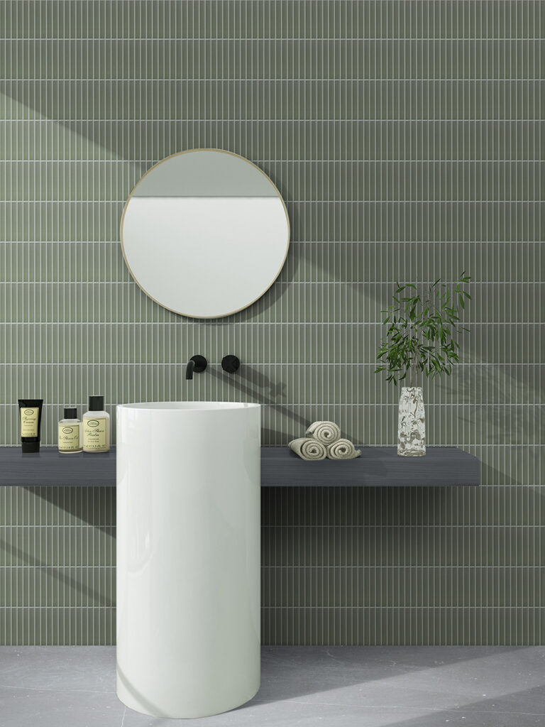
Green continues to be a major color trend in 2026, inspired directly by the natural world. The focus shifts toward softer, more organic shades: sage, olive, eucalyptus, and mossy greens.
These hues bring balance and calm, while pairing beautifully with matte finishes, wood elements, and mineral surfaces.
Where to use them
-
Accent walls
-
Backsplashes
-
Vanities or cabinetry details


3. Reimagined Earth Tones
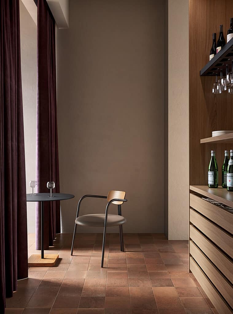
Earth tones remain present in 2026, but with a softer, more refined expression. Terracotta becomes more muted and mineral, joined by clay, warm brown, and soft brick tones.
Used thoughtfully, these colors add warmth without overwhelming the space.
Design tip for 2026
Pair earth tones with warm neutrals like sand or ivory to maintain visual balance.

4. Deep Tones: Subtle Sophistication
Dark colors continue to define interior color trends, but with more nuance. In 2026, we see deeper, more complex shades: chocolate brown, midnight blue, soft bordeaux, and warm taupe.
These tones add depth and character when used intentionally — on an island, a feature wall, or select furnishings — always supported by good lighting and matte textures.
Best for
-
Creating intimate atmospheres
-
Adding structure to open spaces
-
Introducing contrast without excess
5. Expressive Colors, Used with Intention
Bold color hasn’t disappeared — it’s simply more controlled. In 2026, expressive hues appear in refined forms: dusty pastels like powdery pink or muted lavender, as well as warmer accents like honey yellow or icy blue.
These color trends are best used sparingly — in niches, accessories, or small architectural details — to create personality without visual noise.


What’s Changing in Color Trends for 2026
-
-
Fewer cold greys and clinical whites
-
More warmth and natural undertones
-
Palettes designed for longevity, not novelty
-
Color as a supporting element, not a distraction
-
In 2026, color choices feel more intentional. The emphasis is on palettes that adapt to materials, light, and everyday use — colors that feel comfortable over time, not just on first glance.
Curious to see how these colors translate into real spaces? Our Kitchen Trends 2026 article explores how these palettes come to life in one of the most lived-in rooms of the home.